Hello Robot!

Looking back at past projects I completely forgot how tedious my process can be sometimes, especially when I need to depict a light source just right, an emotion just right. I’ll never get anything just right. It’s more like “good enough for now” or “well the viewer will understand this image just enough I hope.”

I hope that in this particular image process that I’m about to share, the viewer will understand the story of Hello Robot in one image.

The story of Hello Robot is very incomplete. I have the images but I can’t seem to get the manuscript “just right” or even “good enough for now” because the reader wont understand the story just enough. Words just can’t describe the way I feel about Hello Robot so maybe light and emotion will.

I’ll start you off by introducing Hello Robot, or Bucket, here.

robosts.jpg attic2colorsketch.jpg

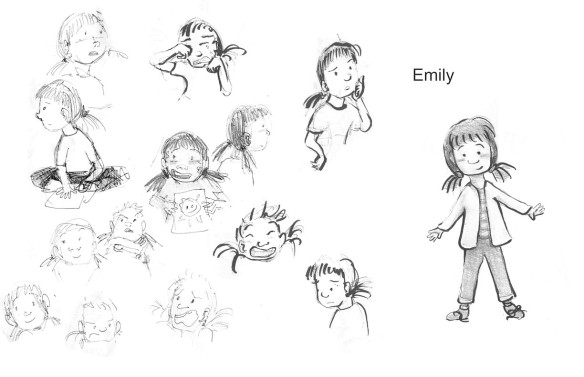
My process for a completed image always begins with character development. I need to know the character before I can accurately create an image of them. Getting to know the character is the longest part of the process, I mean it takes a while to get to know someone properly, right?

Now on to the image which I hope the viewer will understand that is the peak show of character for Bucket here. I first start with a thumbnail and then a detailed sketch like this:

attic.jpg

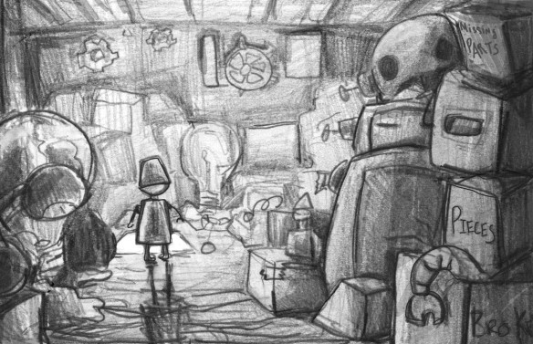
Here I don’t have the lighting quite right but I have the shapes down. The lighting is very important for the entire story but especially this image. You might be able to see why in a bit.

I’ll go on to several color sketches. Depending on the final product, if I work traditionally then I’ll do digital sketches, if I work digitally I’ll do traditional color sketches like these.

atticcolorsketch.jpghellorobotwatercolor.jpg

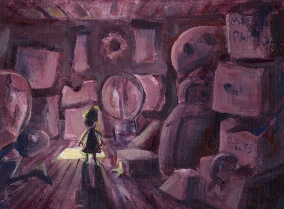
I’m starting to figure it out in the first color sketch and by the second sketch I know what I have to do in order for the emotion and the light to bring about proof of character and peak story arch.

justfordummy copy.jpg

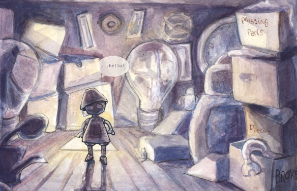
Here I’m finally on the digital. This image is about half way, but I can see the light at the end of the tunnel. I did not track all my process with the digital piece. I never do! Maybe I should do this is the future.

justfordummy1 copy.jpg

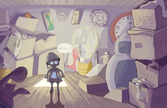
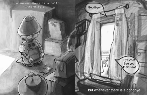
And there you have it, the final! Okay so I went on about light and emotion and stuff for a bit. Light to me can have a bunch of different meanings but the core meaning for me is spiritual. Here Bucket is leaving the light from below to explore the darkness above, an attic. He must do this to complete his exploration of the house to find someone to say “Hello” to that will say “Hello” back. He doesn’t find a hello in the darkness but he does find something else.

Sounds kind of spooky when I put it that way.

Do you understand his emotion? Do you get the “well the viewer will understand this image just enough I hope.”

Hello Robot is a whole story about exploring shadows and saving light sources. but...28_29.jpgUGGGGG 14.jpegbw5 copy 2.jpgcomplete? copy 2.jpg


2019 Maryland Conference

It’s that time again! Yes, the annual conference. 

For my own sanity, I’m making another list of things that I’ll need in order to be completely prepared so let’s see if I can gather everything!


Updated Portfolio

Every year my goal is to update the portfolio. I ALWAYS try to make some FANTASTIC piece each year right before the conference.

This year? Well I’ve made quite a few new pieces that I deem portfolio worthy, but are they really enough? I don’t think I’ll ever know…

dreampiece copy

Two Manuscripts for Official Review 

That’s right, I have TWO manuscript critiques this year. I’ll also be bringing two more for walk in critiques so I want to make sure all four manuscripts are the best they can be. 


Emily copy.jpg


Completed Book Dummy

This year I want to bring the completed Remember Me Emily book dummy. I tried to do this last year with Hello Robot, but I’m afraid Hello Robot wont work quite yet so I didn’t get to bring a dummy last year. I will this year though!

UGGGGG 9.jpeg

My Handy Dandy Notebook (or sketchbook)

Yep, this is actually one of the most important item to bring! This is where I take all my notes the critiquers give me and the information on the panels. I have to make sure I’ve got a fresh one, easy to carry (small) and flexible so I can abuse it haha.


New Postcards and Business Cards? 

Last year I really liked my digital bee that I made. However, I’ve been creating a lot of water color pieces this year so I think I need to use a watercolor image. Should I create new ones or use ones I already have? Hmm… maybe one of these will work.

postcardidea2.jpg

postcardidea1.jpg


And Finally, My “Professional” Self


52605217_2210802585914391_5959403041735049216_n.jpg

Okay ignore that picture. That is NOT professional AT ALL.

Anyway, some nice semi informal clothing seems to be the trend at these conferences so cardigan, black jeans, small cute boots, clean shirt. That seems to work every time!


Pretty sure I need to bring more things but here are the most important, well these and a positive attitude.

Oh yeah and a side note, I’ve started doing reviews again yay! Time to get to posting on this blog again for my own research and lists.


Conference Notes

This weekend’s MD/DE/WV conference, “25 and Still We R(ev)use” was a success!

I’ll share the experience that I had as much as I can. I can’t share ALL my notes because, well, I encourage other writers/illustrators to go to these conferences and hear from agents, editors, speakers, other authors and illustrators for themselves.

At first I got lost in the building. I don’t really know why I got lost, the place wasn’t that big, but I still found myself wandering back and fourth to find the volunteer spot. Eventually I found it of course with the help from the staff and another lady who was ALSO lost and volunteering at the time, which I found out later that she will be the new illustrator coordinator for the MD/DE/WV SCBWI if I’m remembering correctly.

As kind of a side note I’ll say that volunteering is a great way to talk to people if you have social anxiety like I do. When you volunteer you act as a group working toward a similar, simple goal. Being put to use is also a plus.

Technical problems began the keynote speaker session. You know, mic and the slideshow clicker problems. Luckily James Ransome got past that pretty quickly and went on to tell a little about himself:

  • The quote he kept using was “I feel like a lucky so and so” when speaking about his journey to becoming a known illustrator. Quite the journey it was!
  • Has a drawing table from high school which was used a dining room table at some point. (My scribbled notes say “Damn! That must be a sturdy table to last this long!”)
  • He’s created all kinds of different artwork from sports illustrations to children’s books to christmas designs made into bags and cards to landscape paintings. Basically he just wants to create whatever he can in whatever medium he feels like it at the time, which is great in my opinion!
  • A lot of his art inspiration comes from fine artists like Degas, Matisse, Kerry James Marshall, Diebenkorn, and John Singer Sargent to name a few.
  • He loves football.

At this point I had my volunteering time as a walk in critique timer. I feel like this was one of those fated moments that could potentially further a career, but I’ll write about that later.

The “In the Trenches” talk was a good one, mostly for the quotes:

  • When dealing with an agent you don’t want anymore for whatever reason, “Don’t be afraid to leave” advice from Leah Henderson.
  • “Get agented with someone who matches your personality” and when dealing with rejection and stress “Drink wine, eat chocolate, and have a support group” from Courtney Pippi-Mathur.
  • Maria Gianferrari says to “Give yourself a day to wallow” after a rejection.
  • John Micklos Jr says to “develop thick skin” in this business.
  • From my personal notes I wrote that one needs to find an agent that’s more excited about your project than you are because you won’t be able to make a good relationship with your agent if they are not excited about your work (duh!)

I don’t want to spoil too much of Leah Henderson’s “What to Think About when Writing Cross Culturally” so I’ll just write the one thing that stood out to me. When asked about too much censorship, she said something along the lines of “it’s not about censorship. It’s about being aware of blind spots that make their way into the book.”

The best advice overall that the conference gave:

  • A good story brings out an emotional response, laughter, anger, sadness, hope.
  • A good story has STRONG CHARACTERS THE READER CAN RELATE TO.
  • When talking to an agent/editor/author/illustrator/basically anyone human with a different cultural background than you, please don’t “accidentally” be racist, like speaking Japanese or Chinese to an Asian American who doesn’t speak that language…
  • Write from the heart, don’t write fads. Fads go out of style.
  • Allow yourself to cry but don’t allow yourself to give up.

And that’s it folks! I think this conference was more successful to me personally than last years and I’ll soon write about that as well. Again, I suggest writer or illustrator to go out to conferences like this. 🙂


UGGGGG 19 copy.jpg

Jump In! 


The Thing About Postcards 2

I’ve done it!

I mean it took me forever but yay I made a new postcard design!

There were a few more things that occurred to me while making this design:

  • BLACK AND WHITE BACK. While color on the front and back is tempting, creating a black and white design on the back is cheaper (awww yeah!) and it’s also a good opportunity to show your viewer a sample of your rendering or line work.
  • ILLUSTRATE YOUR OWN FONT. I mean you don’t have to, but if you can, why not? It shows another skill you could potentially use.
  • MAKE SOMETHING POSTCARD QUIRKY. What I mean is design something like the little square spot for the stamp to go in. I’ve also seen illustrators add lines for the address. Ultimately this is a good opportunity to show awareness of the space the image is in rather than just slapping on a pre made image on a postcard. I’m not saying that that’s bad, just perhaps a missed opportunity.
  • ORDER EARLY!!! I procrastinated because I didn’t know exactly what I wanted for a postcard. I was also designing a business card and working on portfolio images for my critique. Now I’ll have to pay extra for shipping to get here on time and it will be expensive. Luckily I’m getting taxes back…
  • MATCH BUSINESS CARD. Have a theme! This year’s theme is working on something with a tool. I know sounds kind of simple, but that’s what happened. I think the business card and postcard go with each other pretty well this year.
  • And last, BE AWARE OF THE CUT OFF SPACE AROUND THE CARD. I spent like a good hour getting the image below to the “safe” point so that nothing gets cut off to the point of awkwardness. I had to go back into photoshop multiple times for my business card so that the bee wouldn’t get cut off. Some of you will probably already be aware of this space but I’m just throwing it out there as a reminder.
postcard?.jpg

Front

backofpostcard2 copy.jpg

Back


handwritten2.jpg

Business card


And that’s it! I’m *almost* ready for the conference next weekend!

ReFoReMo Time!

It’s that time of year again!

The time where everything seems to happen all at once and you make too many promises to too many projects and then explode.

This also happens to be the time for ReFoReMo!

If you don’t know what that is, click on that link above for a more detailed explanation than what I give here.

READINGforRESEARCH2018Logo.jpg

ReFoReMo is a full month of picture book reading and reading about other people reading picture books haha. Each day a guest speaker is posted on the blog and talks about a theme for your set of books that day. Some books are repeated because each guest speaker has a something different to say. ReFoReMo is a great way to analyze picture books and talk about what makes each book WORK.

I didn’t quite get to ALL the books last year, (there was around 100 books I think?) but I certainly got to most of them and the blog posts are always good. Oh, they end with a prizes too.

So go sign up… if you and your local library is up for the challenge. 😉


Passion Projects

As I continue to look through my notes from the conference I realize that… sheesh I have alotta notes.

That’s a good thing though!

These next set of notes are from a presentation titled “Passion Project”that was given by Alyssa Nassner, one of the people who critiqued my portfolio. Mostly for illustrators, but I think you can apply this to writing as well.

To start out, a passion project is a series of works that focus on a specific skill or topic, whatever the illustrator (or maybe writer!) is passionate about.

What makes a passion project? She listed:

  1.  Motivation (The will!)
  2. Inspiration (Idea)
  3. Creative Freedom (No one tells me what to do!)
  4. Time (Carve out time in you schedule!!!)

What does a passion project do?

  1. Improves work through practice.
  2. Increases online visibility.
  3. Demonstrates a consistent art style.
  4. Show cases interests (what inspires creativity?)
  5. Inspires others.

What should YOU do?

  1. Ask yourself what interests you?
  2. What skills would you like to improve?
  3. What type of industries interests you?
  4. Is there a grab in the market?
  5. What is fun and makes you happy?
  6. SET A REALISTIC GOAL!!! (This one is in all caps for me haha)

Nassner also goes into a bit about social media (side note, she pretty much scolded me for not having a URL or domain name, whoopsies, need to do that.) Pinterest and Instagram seem to be the big ones. Twitter, Facebook, and tumblr are others.

Basically, if you’re making a passion project share it! Everywhere! 

To end, my personal passion projects will be to work my on my line work with a weekly illustration, and to work on figure drawing/painting.

The line work will be a weekly project where the figure drawing/paintings will be a daily thing, starting next month when I clear my shed of the winterly spiders.

And this is where I begin my passion project.

thingsintherecolor1 copy.jpg

Hope you guys have fun with yours!

The Pause

The Pause is personally one of my favorite techniques an illustrator could use. Please pause that writing, let the illustrations take over in the silence. Let me as the reader understand, realize the moral of the story the writer and illustrator has worked so hard to bring together.

I’ve written about how A Sick Day for Amos McGee creates the pause in it’s pages. A story about an elderly zoo keeper visits his animal friends at the zoo, but then he becomes sick! So what do the animal friends do? They visit him. The turnaround in the story is shown with four page spreads, two of those pages lacking words and altogether only nine words on the eight pages of content. 

A Sick Day for Amos McGee is only one example of the pause. Extra Yarn by Mac Barnett, illustrated by Jon Klassen is another. 

extrayarn.jpg


Throughout Barnett’s work, the play between color verses black and white sets the concept of adding a little color with creativity into the world where color and creativity may be lacking. Each page spread has text all except the second image above. 

To shorten the story, the main character finds this box of never-ending colorful yearn and uses it to change her grey environment. A Duke learns of this never-ending colorful yarn and steals the box. However, when he opens the box for himself, it is empty and he throws it away. The box eventually comes back to our main character and again it is full of the colorful yarn. 

The pause here only uses the word “But” and then silence as the reader knows that box is going to end up back where it began, to the creative individual who has never-ending creativity, finding value in the “empty” box. If that pause wasn’t here the ending wouldn’t be nearly as satisfying as it was. Perfect example of show, not tell. 

So there are pauses like the two examples above, and then you have a pause like in Dragons Love Tacos by Adam Rubin, illustrated by Daniel Salmieri. 

dragonslovetacos.jpg

In this entire story, the narrator constantly reminds the reader that while dragons love tacos, never ever EVER give them spicy ones. This pause here is to simply give the reader a comedic, complete and utter visual effect of just why you should never give a dragon a spicy taco. 

Even Maurice Sendak used the pause in Where the Wild Things Are.

wherethewildthiingsare.jpg

This pause lasts for three page spreads of Max and the wild things romping around and being…wild. Another example of show not tell until the last image shown above where Max is beginning to miss home. 

The moral of the story? There is no place like home. One may wander away from a familiar setting, get lost in day dreams and adventures, however they always return.

I think these four page spreads really dig this theme in deep. The wild fun, the lost in time adventure that Max has becomes stale and his reaction is illustrated in that sitting pose and home sick face.

The last one I want to look at is very different from the four mentioned above. The Dark by Lemony Snicket, illustrated by Jon Klassen pauses the illustration, not the text. 


Thedark.jpg


Above you have three images that represent pretty much what the entire story looks like. Abstract illustration compositions, lots of space, little text throughout the entire story…except for one page.

UGGGGG 5.jpeg

Space, space, space and then…BAM! Wall of text, a pause in the illustration and design! What? Who does this? Is this acceptable within the picture book world nowadays to have a a wall of text like this? 

This wall of text symbolizes confrontation. The main character is confronting his fear of the emptiness, the darkness. The wall of text is confronting the reading, interrupting that abstract, design based flow. The main character realizes the dark isn’t all that bad and this text makes the reader realize this as well. 

I’m still not sure if this text would be appropriate to some readers. Text ultimately should be evenly spaced throughout the book, not forced in on a single page. However, without this pause in illustration, I don’t think the point of not fearing the dark would have come across as well as it did. 

So that’s it folks! The pause is a technique that I’ve tried using as well. I may not have it down as masterfully as the creators did mentioned above, but I might make a great pause one day.

A Sick Day for Amos McGee

Amos McGee loves visiting his friends at the zoo while he works. But one day the zookeeper wakes up sick and his friends the elephant, the tortoise, the penguin, the rhinoceros, and the owl decide to visit him instead.

UGGGGG 6.jpeg

The Stead’s work brings you a wonderful story with a great friendship, splendid pacing, cute animals, and the charming Amos McGee all rolled into one. With Philip C. Stead’s wonderfully written work and Erin E. Stead’s beautifully illustrated woodblock printings and pencil, you have a timeless work of art here.

Now I’m going to be steering a bit from my usual review formula because it is the month of STORYSTORM. These are the books I love and cherish.

I would like to start off with looking at the great characters, the main character being an elderly man instead of a child and IT WORKS. There are tons of children’s books out there that have animal and child characters that work but not many with an elderly old man who is sick for a day. During the thousand times I’ve heard or read that I need only children and animals (that’s it!!!) in my illustration portfolio, I always think back to Amos McGee and remember there are exceptions.

Aside from great characters (hey the animals are great too) the pacing is wonderful. I’m talking mainly about the images below…UGGGGG 7.jpegUGGGGG 8.jpegUGGGGG 9.jpegUGGGGG 10.jpeg

Only nine words here and that is eight pages worth of story and it is the best thing these creators could have done. Sometimes when there is a turning point in a story, the best thing is to allow the illustrations take control to set the mood. Extra Yarn by Mac Barnett, illustrated by Jon Klassen, also does something similar with their turing point. I will show that later.

And to wrap up, the Steads’ work really is a timeless story. Most people who do read pictures books (teachers, parents, kids, book lovers, creators…) have read this book. And if you haven’t and you are interested in writing and/or illustrating picture books I highly recommend it.

The good list:

  • GREAT bedtime story
  •  Short, sweet, to the point
  • Illustrations are marvelous
  • Good story time material as well I would think
  • Lovable characters
  • Pacing is good enough for taking notes on a way to pace a story
  • The story is simply about a good friendship.

That’s it for today! Hopefully these images remind or inspire anyone who is reading this and is doing the STORYSTORM challenge. They most certainly inspire me!

Oh! Philip Stead’s website


Line Up Reads for Inspiration

This month is the month of STORYSTORM, a whirlwind of idea generating madness.

To try to gain some inspiration for the next month, I will be adding a list of favorite picture books  and reviewing them. Some old, some new, but all good stuff.

Writing reviews for my favorite picture books will give me a closer look into how they make me love them and will hopefully inspire new ideas. Unfortunately I’ve already reviewed Pete the Cat and Dragons Love Tacos, because they would totally be on my list, but I still have plenty to go!

Here is the lineup:

  1. A Sick Day for Amos McGee by Philip C. Stead, ill. by Erin E. Stead (2010)
  2. Extra Yarn by Mac Barnett, ill. by Jon Klassen (2012)
  3. Ramble of one of childhood favorite Author/illustrator Maurice Sendak, Where the Wild Things Are, because I have to. (I have the 50th anniversary copy 2013)
  4. The Noisy Paint Box: The Colors and Sounds of Kandinsky’s Abstract Art by Barb Rosenstock, ill. by Mary Grandpre (2014)
  5. The Bear Ate your Sandwich by Julia Sarcone-Roach (2015)
  6. Thank you, Octopus by Darren Farrell (2014)
  7. The Dark by Lemony Snicket, ill. by Jon Klassen (2013)
  8. Bloom by Doreen Cronin, ill. David Small (2016)
  9. One Cool Friend by Toni Buzzeo, ill. by David Small
  10. Lady Pancake & Sir French Toast by Josh Funk, ill. by Brendan Kearney
  11. How Do Dinosaurs Say Good Night? by Jane Yolen, ill. by Mark Teague (2000)
  12. Firefly Mountain by Patricia Thomas, ill. by Peter Sylvada (2007)
  13. Ramble about another childhood favorite The True Story of the 3 Little Pigs! by Jon Scieszka, ill. by Lane Smith and more (25th anniversary addition)
  14. Please, Louise by Toni Morrison and Slade Morrison, ill. by Shadra Strickland (2014)
  15. There Was an Old Dragon Who Swallowed a Knight by Penny Parker Klostermann, ill. by Ben Mantle (2015)
  16. Ramble about Wanda Gag’s Millions of Cats and why she inspired me to illustrate/write children’s books in the first place.
  17. Louise Loves Art by Kelly Light (2014)
  18. Rosie Revere Engineer by Andrea Beaty, ill. by David Roberts (2013)
  19. The Grudge Keeper  by Mara Rockliff, ill. by Eliza Wheeler
  20. I Don’t Want to be a Frog by Dev Petty, ill. by Mike Boldt (2015)
  21. Rules of Summer by Shaun Tan (but more just Shaun Tan work in general)

Okay! That’s a pretty big line up, but I’m ready to get to writing~